Thursday, November 15, 2018

4 Websites


My Favorite Picture
I looked at the oldest things on this planet, which mostly consists of nature things. By nature things I mean trees, forests, and rocks. It also includes information about the author, and her decade long adventure to photograph these amazing relics.

1. I picked this photo because I really love how the branches seem to be reaching out at me. 
2. I believe they could have used Cropping to not distract away from the center of the thick tree.
3. Rachel Sussman took these pictures. 


My Favorite Picture

This website mostly consists of pictures of staircases, and how their spiral beauty is portrayed by the photographer. The different ways the stairs are shaped is particularly interesting, because I feel like the less square stairs are more elegant. 

1. I choose this picture because the yellow and off white colors look really vintage.
2. I would say that this staircase picture follows the rules of Depth in a way, because the stairs get smaller as they get farther away.
3. Christian Richter took these photos of the stairs. 


My favorite picture(from the timelapse)

The link just shows you the amazing timelapse from Rio De Janeiro 

Thursday, November 8, 2018

Cover Types

Image based covers are the most basic approach to a cover

Favorite Cover

Best Cover Winner
GQ
"The World's 50 Greatest Living Athletes," November 2017
Fred Woodward, Designer
Pari Dukovic, Photographer
"When the World's Greatest Living Athlete is also an off-the-court phenom in business, in movies, and increasingly in politics, the time allotted for a photo shoot is limited (it was 45-minutes from the frame to the last). But photographer Pari Dukovic nevertheless captured LeBron James in a timeless, almost deified image that shows the strength, fierceness, and regal nature of GQ’s November cover subject. One worthy of blowing up and framing like a piece of art (which we did)."
If I had to critique this picture I would say that, even though the intention of this picture is to show that he is the king, he could have smiled. I feel like the picture needs to be less dark and needs to have more colors than just grey, white, and gold. He is furrowing his brows, and it gave him forehead wrinkles. They could have made his tattoos merge into the words, because that also looks slightly odd. They could have put a different person entirely in the cover too, but they choose LeBron because he's the most popular. That isn't necessarily true though, because Curry is just as if not more popular than LeBron. 
I STILL LOVE HIM THOUGH!!!!!!!

Best Covers

Entertainment:
1. Informal 
2. Formal
3. Informal
4. Formal
5. Formal
6. Formal

Lifestyle:
1. Formal
2. Enviormental
3. Enviormental
4. Formal
5. Formal

Sports:
1. Formal
2. Enviormental
3. Formal 
4. Informal
5. Enviormental
6. Formal

Beauty:
1. Formal
2. Formal
3. Informal
4. Formal
5. Informal

Readers Choice:
1. Formal
2. Formal
3. Enviormental
4. Enviormental
5. Informal


Magazine Tips

I need to be thinking about pulling peoples focus to my cover by making them curious.I also need to make it easy to read at a glance. Without leaving out the juicy important details that will pull people to pickup the cover.I need to make people think that they need the magazine for some reason. I have to make people want to take my cover by pulling at their heart strings somehow.

Tuesday, November 6, 2018

Mural Project Preveiw

1. Some ideas of things we could shoot around Austin could be lines, and We could take pictures of things that include lots of lines. We could also Shoot about Flowers and sort them all by Colors. Another idea that could be cool is nightlife in Austin, and we could go around in the night and shoot the moon, the skyline at night, the lights all around this city would be the main focus. 
2. I would be using a school camera. You have to think about Aperture, Shutter Speed, and our ISO when shooting in Manual. 
3. We could create a profile on instagram thats dedicated to the pictures we take for this project. We could create a blog specifically for this project and this group. We could 

My Self Portrait Plan

I plan to shoot a few of my friends for my self portrait project, and their names are Emilia, Ava, Laura, and maybe myself if all else fails. I plan to change the setting of my photos to see which one is the best, but a few ideas I had were...   
  • My room
  • The forest
  • A playground
  • The park 
  • South Congress 
If I can't do any of those I'll come up with something else. Some things I will do to make the shot successful is adjust the camera to the proper Manual settings, and I want to try to play with the focus of the picture so that I can get the most out of my photos. 

Casual Portraits I Like

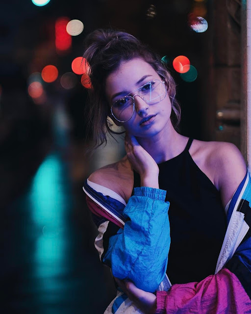
One thing I like about this picture is the jacket, and how the colors pop in the background.
In this photo I love the how the dress in all around her, and how she's laughing with a big smile. 

Self Portraits I Like

 In the photo above I appreciate how the photographer went at an angle and got the light to hit her so that her cheek bones could really stand out. 
I love the flowers in her hair and how the color pops against her red hair. 

Environment Portraits I Like

 I really love hoe the sun is coming over the landscape and the shadows of the grass are very nice. 
I really like how the background is out of focus and the woman looks serious so it's more artistic. 

Self Portraits Preveiw

Take Unfocused Shots

As photographers we have ‘sharp focus’ drummed into us as an ultimate objective to achieve in our work – but sometimes lack of focus can create shots with real emotion, mood and interest.
There are two main strategies for taking unfocused images that work:
1. Focus upon one element of the image and leave your main subject blurred. To do this use a large aperture which will create a narrow depth of field and focus upon something in front of or behind your subject.
Introduce a Prop
Add a prop of some kind into your shots and you create another point of interest that can enhance your shot.
Yes you might run the risk of taking too much focus away from your main subject but you could also really add a sense of story and place to the image that takes it in a new direction and gives the person you’re photographing an extra layer of depth that they wouldn’t have had without the prop.

Experiment with Lighting

Another element of randomness that you can introduce to your portraits is the way that you light them. There are almost unlimited possibilities when it comes to using light in portraits.
Side-lighting can create mood, backlighting and silhouetting your subject to hide their features can be powerful.